A new presence.
The same LION spirit.
Logo redesign and visual identity exploration for LION Sales & Marketing, by Welland Labs.
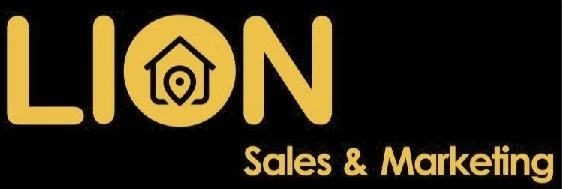
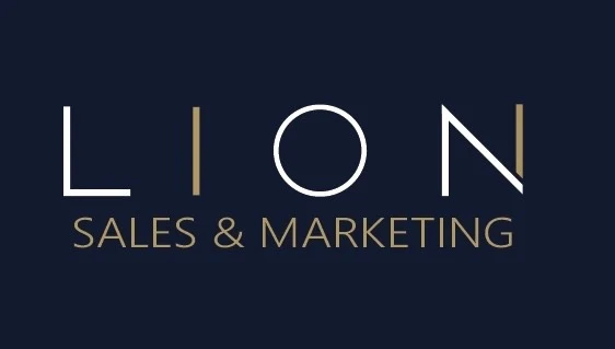
From a bold yellow-and-black logo to a more considered navy, gold and white identity. We explored how typography, geometry and a consistent visual language could give LION a refined presence across print and digital.
- Logo redesign
- Wordmark & monogram exploration
- Brand application mockups
- Website visual direction
One identity.
Room to make an impression.
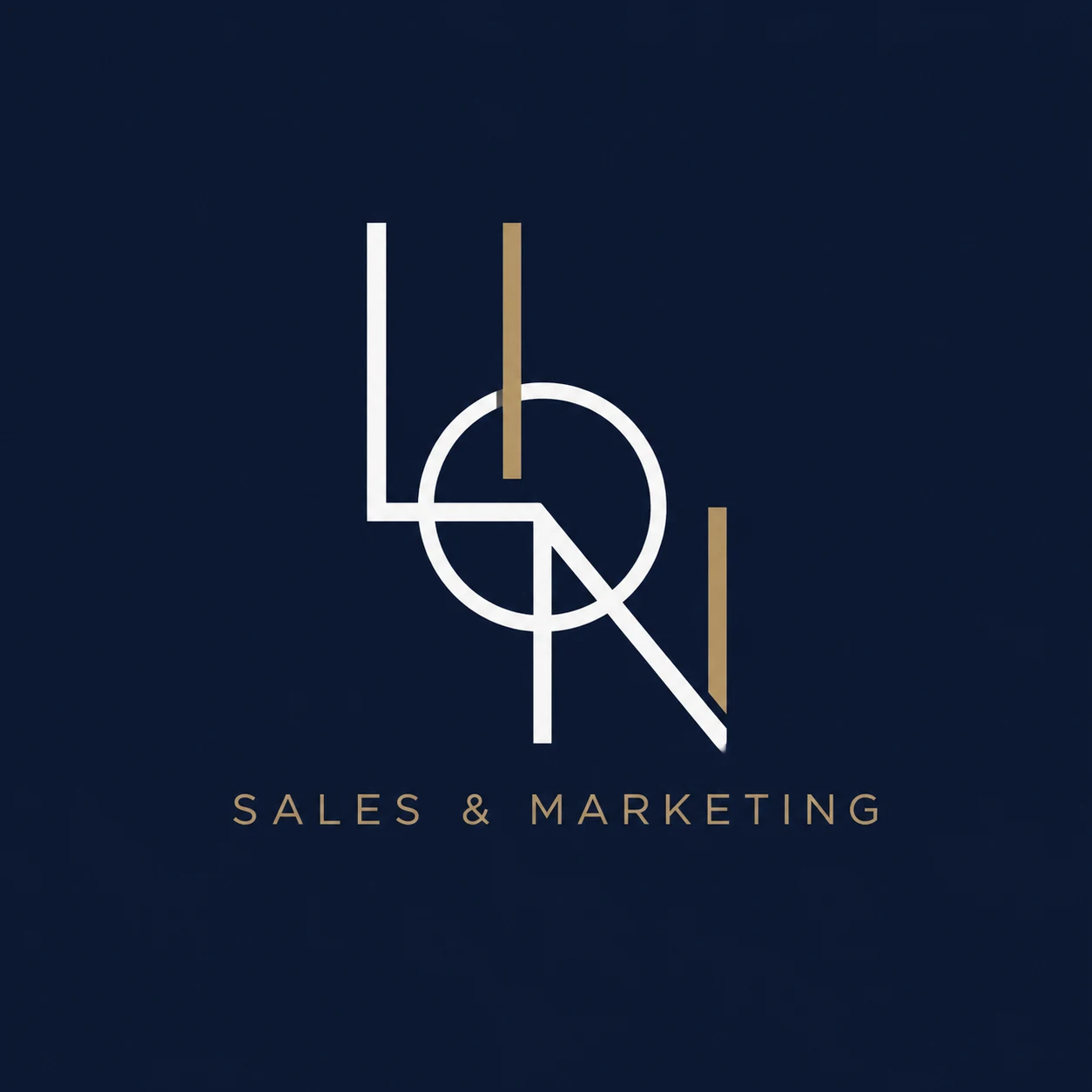
The redesigned wordmark gives the name space to breathe. A complementary geometric monogram explores a more compact expression of the same letterforms.
Deep navy provides the foundation, with white for clarity and muted gold for warmth. Together, they establish a consistent direction for business stationery, campaign concepts and the website.
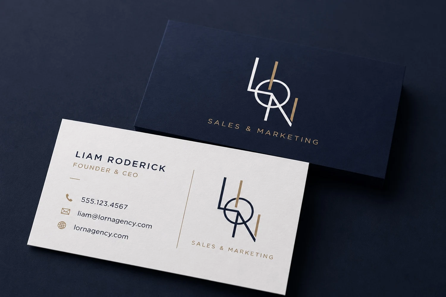
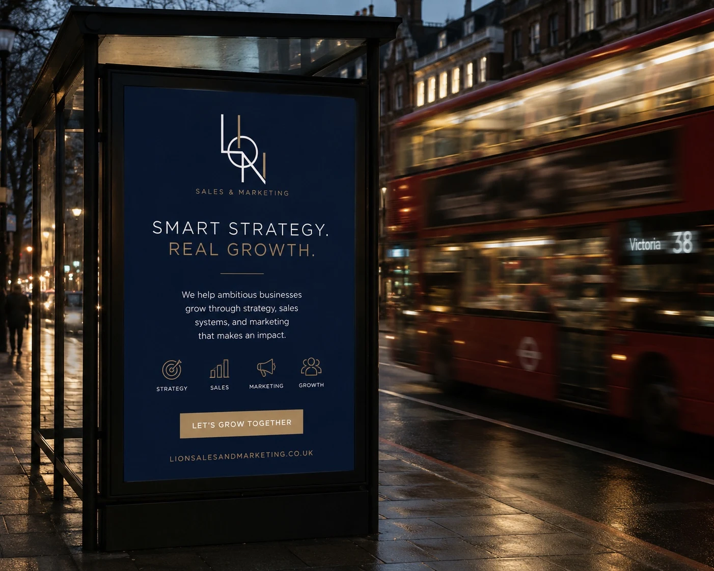
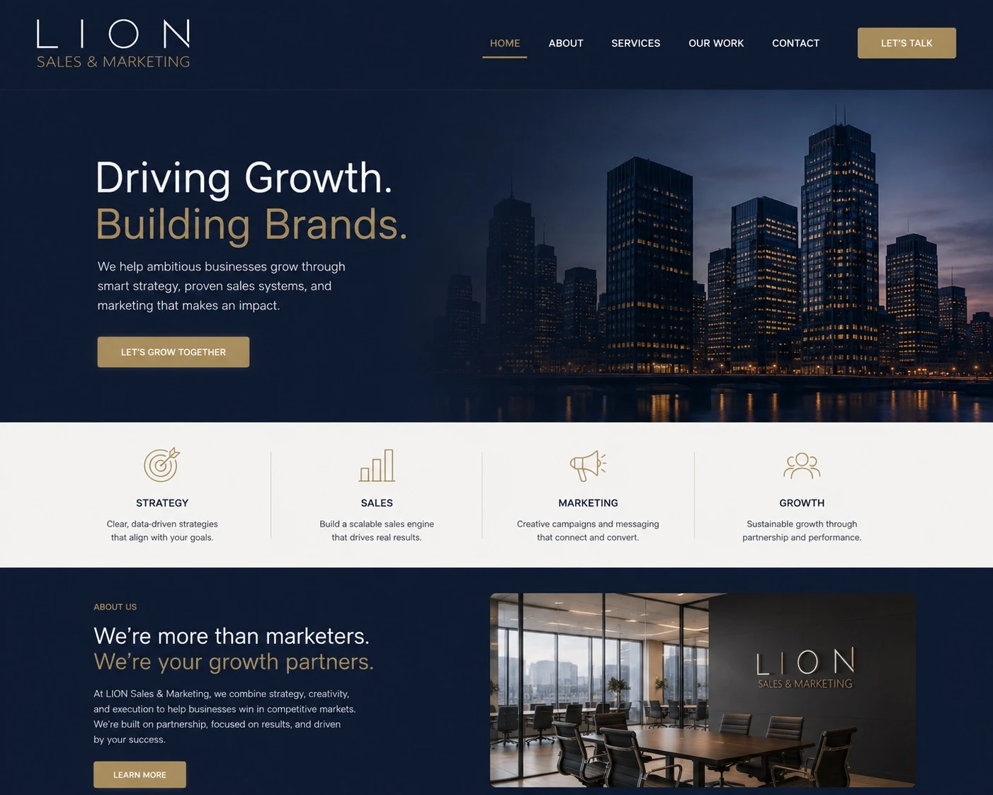
A coherent visual direction that carries LION’s identity from a standalone logo into a wider brand experience.
The applications shown are design mockups, rather than evidence of a live website, printed materials or an advertising campaign.