Two familiar names.
Two independent futures.
Separating the identities of two complementary property businesses, while keeping the names their clients knew.
LION handled sales and marketing for property developers. ROAR focused on PR, communications and social media within property development. The two clients offered complementary expertise, but their shared brand identity tied their stories closely together.
- Brand separation
- Logo redesigns
- Wordmark & monogram exploration
- Brand application mockups
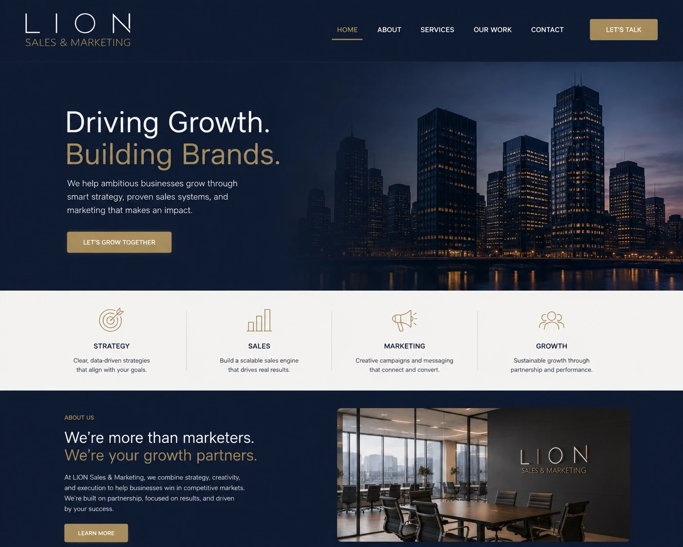
- Website visual direction
Keep the recognition.
Create room to grow.
The brief was to uncouple the two brands so each business could expand beyond the confines of their shared identity. Retaining the established LION and ROAR names was central to the work: both needed the freedom to move forward while preserving the recognition they already had.
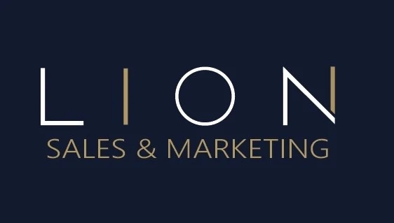
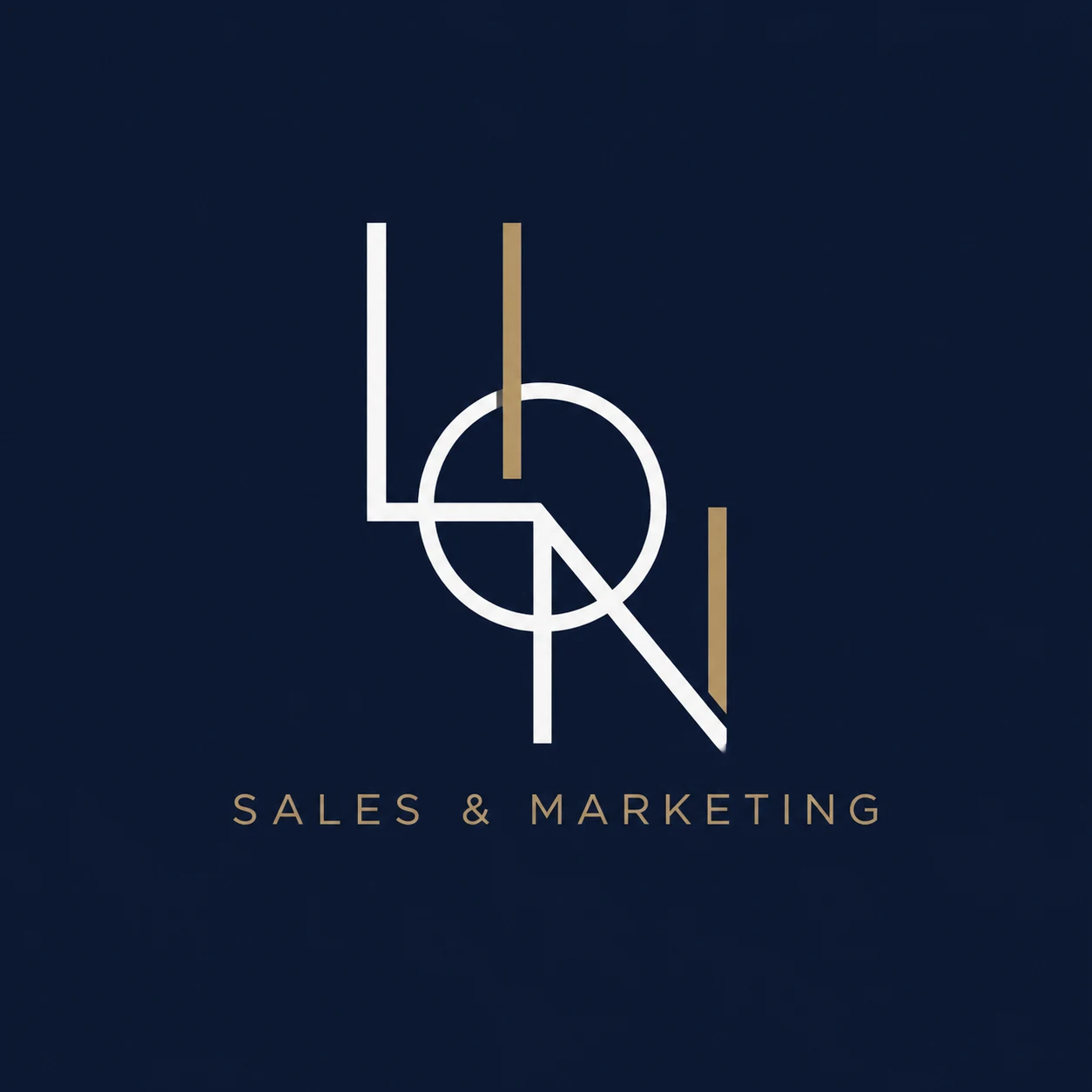
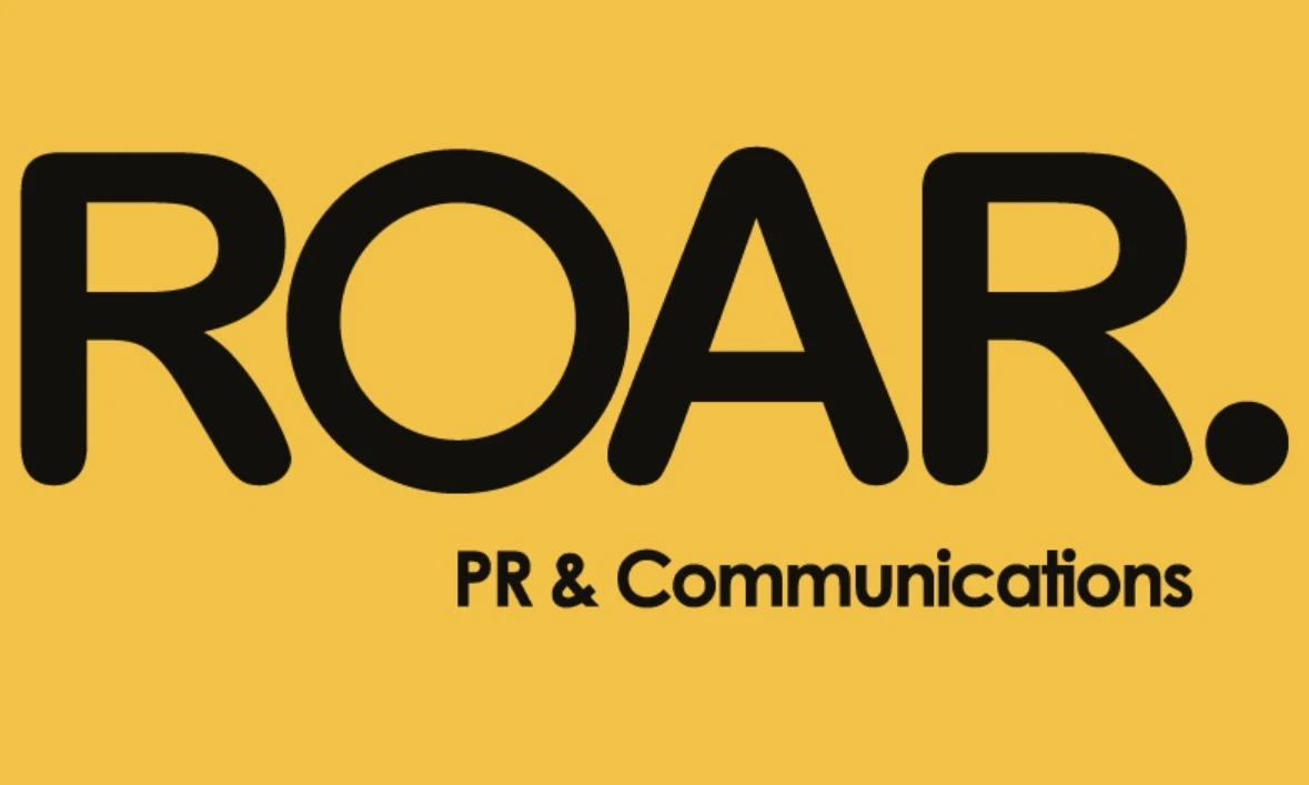
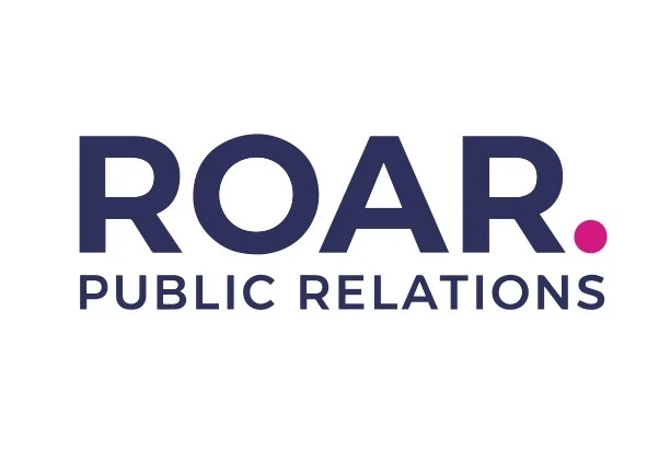
Working with both clients, we developed distinct visual directions that gave each business a presence of its own. LION’s identity uses navy, gold and white with a refined wordmark and geometric monogram. ROAR pairs navy and white with vivid magenta and a distinctive full stop.
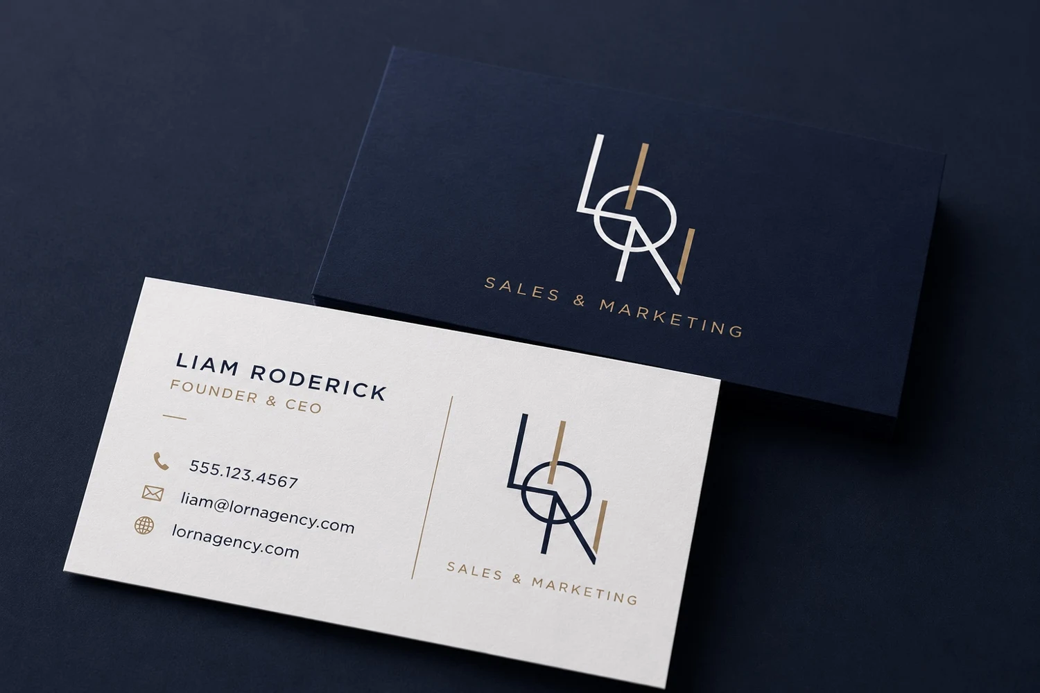
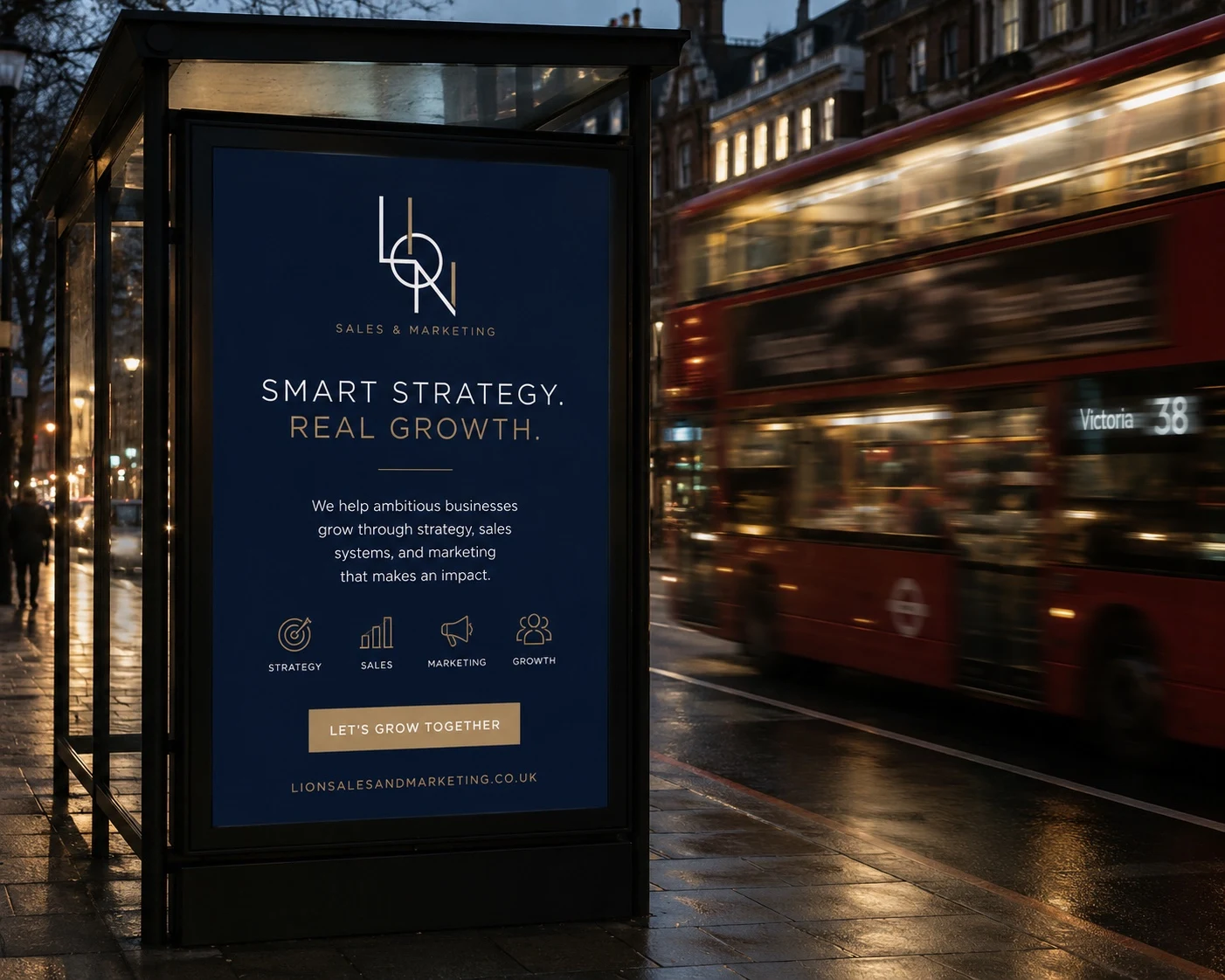
Each direction was explored across stationery, campaign and website concepts, showing how the brands could tell their own stories and support opportunities beyond their original shared identity.
LION Sales & Marketing
A considered identity rooted in property sales and marketing expertise, designed to give LION room to grow in its own direction.

A refined presence.
The same LION spirit.
The redesigned wordmark gives the name space to breathe. A complementary geometric monogram explores a more compact expression of the same letterforms.
Deep navy provides the foundation, with white for clarity and muted gold for warmth. Together, they establish a consistent direction for business stationery, campaign concepts and the website.
ROAR Public Relations
A voice of its own for a PR, communications and social media business, designed to express ROAR’s expertise and support its next chapter.
A distinct presence.
A clearer voice.
The redesigned wordmark gives the name space to breathe. A distinctive magenta full stop gives the identity a recognisable accent.
Deep navy provides the foundation, with white for clarity and vivid magenta for emphasis. Together, they establish a consistent direction for business stationery, campaign concepts and the website.
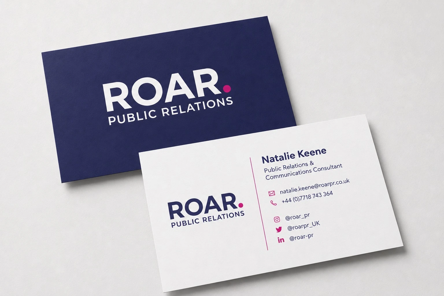
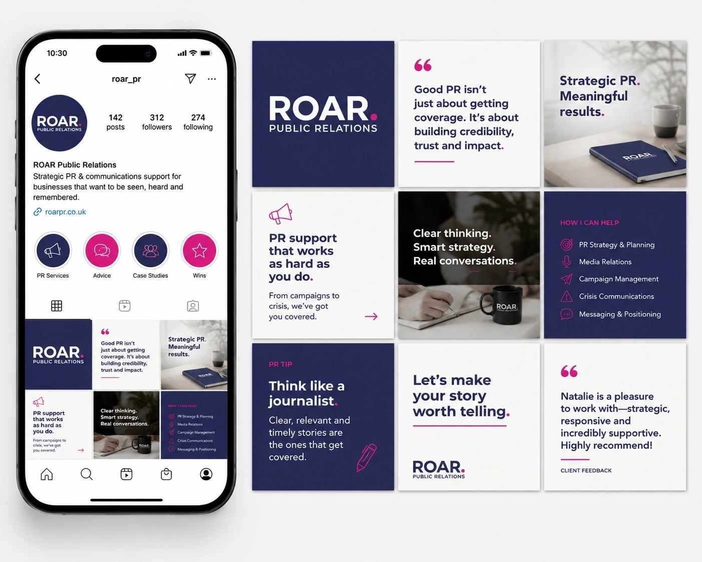
Two distinct identities, designed to help LION and ROAR grow independently while keeping the names and recognition they had already built.
The applications shown are design mockups, rather than evidence of live websites, printed materials or advertising campaigns.